SCATTER PLOT MATRIX
SAS doesn’t have built-in procedure to do that automatically for you. So I will show you how to use one of the built-in GUI’s(Graphical User Interface) to create scatter plot matrix. It is called SAS/LAB that is a package in SAS (it is included in SAS base boundle, so you don’t need to install it additionally).
There is one thing to be done before you start the application ( SAS/LAB). You have to have your data set in SAS format on hand.
Here, I again construct a demo example:
Recall the GPA data set used in #3.3, we have four variables:
Y: GPA
X1: Entrance Test Score
X2: Intelligence Test Score
X3: High School Score Average
First, I create a data set in SAS format, PR3_3, stored in work library.
DATA pr3_3;
INFILE 'c:\neter\ch03pr03.dat';
INPUT gpa ent_score int_score high_avg;
RUN;
Make sure you are dealing with the correct data file, and it is successfully created.
Next, we want to start the application:
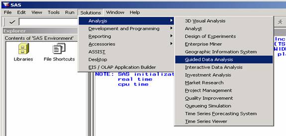
Click “Solutions” à “Analysis” à “Guided Data Analysis” like below:
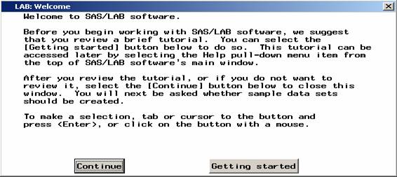
You will see a dialogue window asking you if you would like to start the tutorial. Click “Continue” to skip the tutorial. (The following three windows appear only if you use SAS/LAB at the first time!)
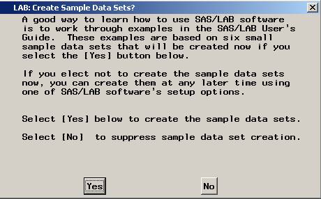
Click ‘Yes’ to create sample data sets; ‘No’ to skip the creation.
How nice it is! WELCOME you to use SAS/LAB!
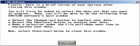
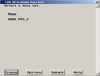
Click ‘Continue’ to proceed! You will see a window displaying all the available data sets. You can see there is a data set called PR3_3 under WORK library. So click on the label to select it, then press ‘create’ to include it!!
Next you will see a template of application appear like:
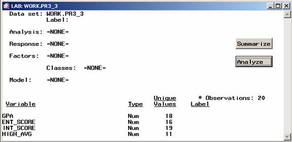
We saw the contents of the data set on the bottom of the panel. Nice right? SAS/LAB provides several analyses for your use. I will guide you through the regression analysis.
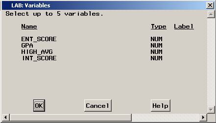
First, as I mentioned in the beginning, I would like to take a look at the scatter plot. Here we have four numerical variables, so it is better we take a look at scatter plot matrix (you may think that is a combo of pairwise scatter plots).
So, click ‘Summarize’. It will pop up a window waiting for you to specify the interested variables set.
Click the labels to select them like:
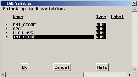
Note: single click to enable it, double click will disable it. After you finish selection, click ‘OK’ to proceed. You will see the scatter plot matrix like below. It has labels on the side of the panels. The label stands meaning of the row/column attribute.
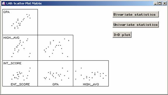
You can see the linear relationship in the top panel of first column. That is the scatter plot of GPA v.s. Entrance test score. The other plots didn’t show any clear tendency. So, formally speaking, the first predictor for simple linear regression model that we would try is entrance test score. Recall the previous results from Problem 3.3. Is the previous result coincident with the information shown here?
Save this graph for future use by clicking ‘Journal’ à ‘Save current graph’ on the menu bar. It will be saved as a object in the work library. You need one more step to access it for word processor usage.
After saving it, click ‘Journal’ à ‘Reviews’ à ‘Saved graphs’:
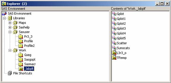
The explorer window will pop up. Click work/_labplt then you will see several plots on the right panel. The scatter plots matrix is the one labeled as Scatter by default. Double click it, you will see the familiar graph window pop up like:
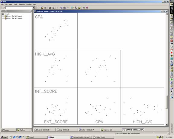
Then you can save this plot in the format you want like usual.